A new look. Real chauffeurs. Authentic personalities.
Today, we rolled out a new appearance to champion our dedicated crew of chauffeurs and the personalized services they deliver.
Here’s why we decided to refresh our platforms so you won’t be too surprised next time you log in to our app and website.
The new icon
First, our new app icon. We know, it borders on abstract.
We took some time to think about how we could champion our chauffeurs and their services within a single element. We kept coming back to the color black, which runs through the black suits of our crew and the luxury black vehicles we offer. But how do you use a single color to embody all that our chauffeurs and services stand for, while also creating a recognizable and emotive icon?
Our designers ran with the idea of “embrace the black” and after a long, collaborative process between our design, brand, and leadership teams, they created a black square with the bottom half right triangle slightly lighter to simulate the reflection on one of our luxury black vehicles.
While an all-black icon eliminates the familiar “B” location pin from our app, the new icon unites our digital and physical experiences.
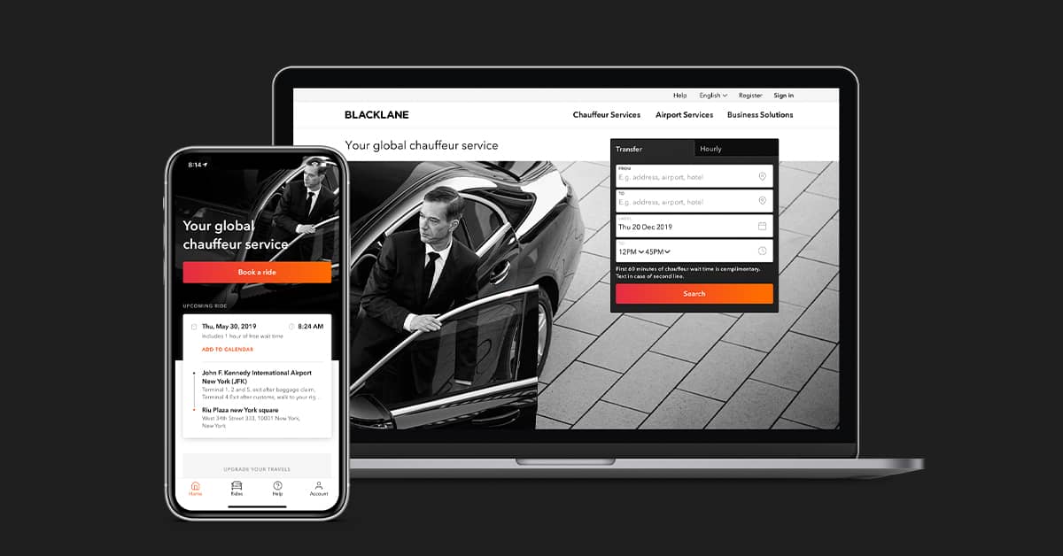
The new website and app
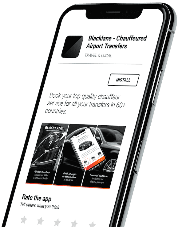
Second, our website and app. The old site combined color images, various shades of black, and a lot of information into one area. It was crowded, clunky, and inconsistent. It didn’t reflect how we saw ourselves as a company.
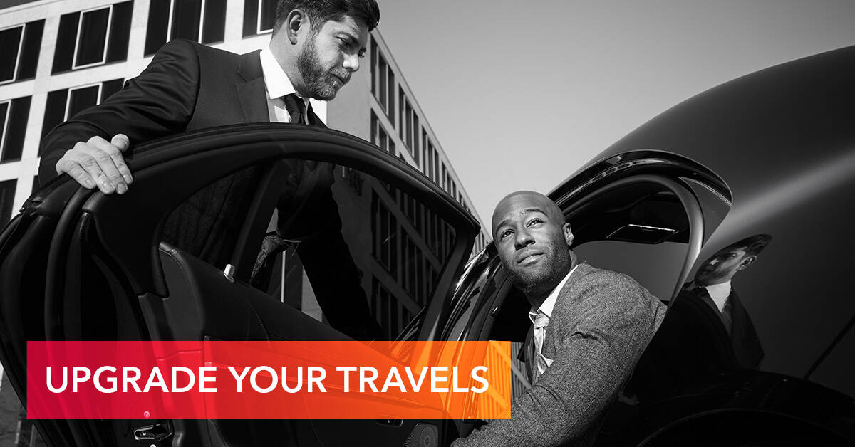
We went through a major re-focus over the past year, breaking away from the constraints of the legacy limousine world to showcase our crew — their authentic personalities, their service mindset, and their local expertise.
We decided to make the lead image all about the chauffeur. We moved away from the old-school driver look and now celebrate who our chauffeurs are, the individuality they bring to each ride, and the care and attention to detail they provide to each guest.
New look and feel
We cleaned up our navigation menus and now feature our app download options higher because we know our guests are always on the move.
We’ve also injected some color across our platforms, with a vibrant rose-orange gradient to show the dynamic of movement, of creating a seamless and smooth journey.
The new tagline
Lastly, our tagline. The old version was dated and restrictive. It boxed us into the transportation service category and didn’t reflect our global future, which is to takes Blacklane beyond the road.
Our new tagline, “Upgrade your travels”, is something we’re really focused on here at Blacklane. We want to take care of your travel journey from your front door to your next meeting, and to a new holiday destination. What’s most important is not our services, but rather your elevated travel experience.
For us, our services are so much more than getting you to the next destination. They’re about being prepared, knowing the roads, navigating the terminals, reading each guest, catering to every need, and offering local expertise to enrich every experience.
We know you’re busy, so we just wanted to give you some ideas behind our thinking for our rebrand. We’re still Blacklane. But we’ve found our voice.
With 🖤,
Your Blacklane crew